創意服務
Website Design
Summary
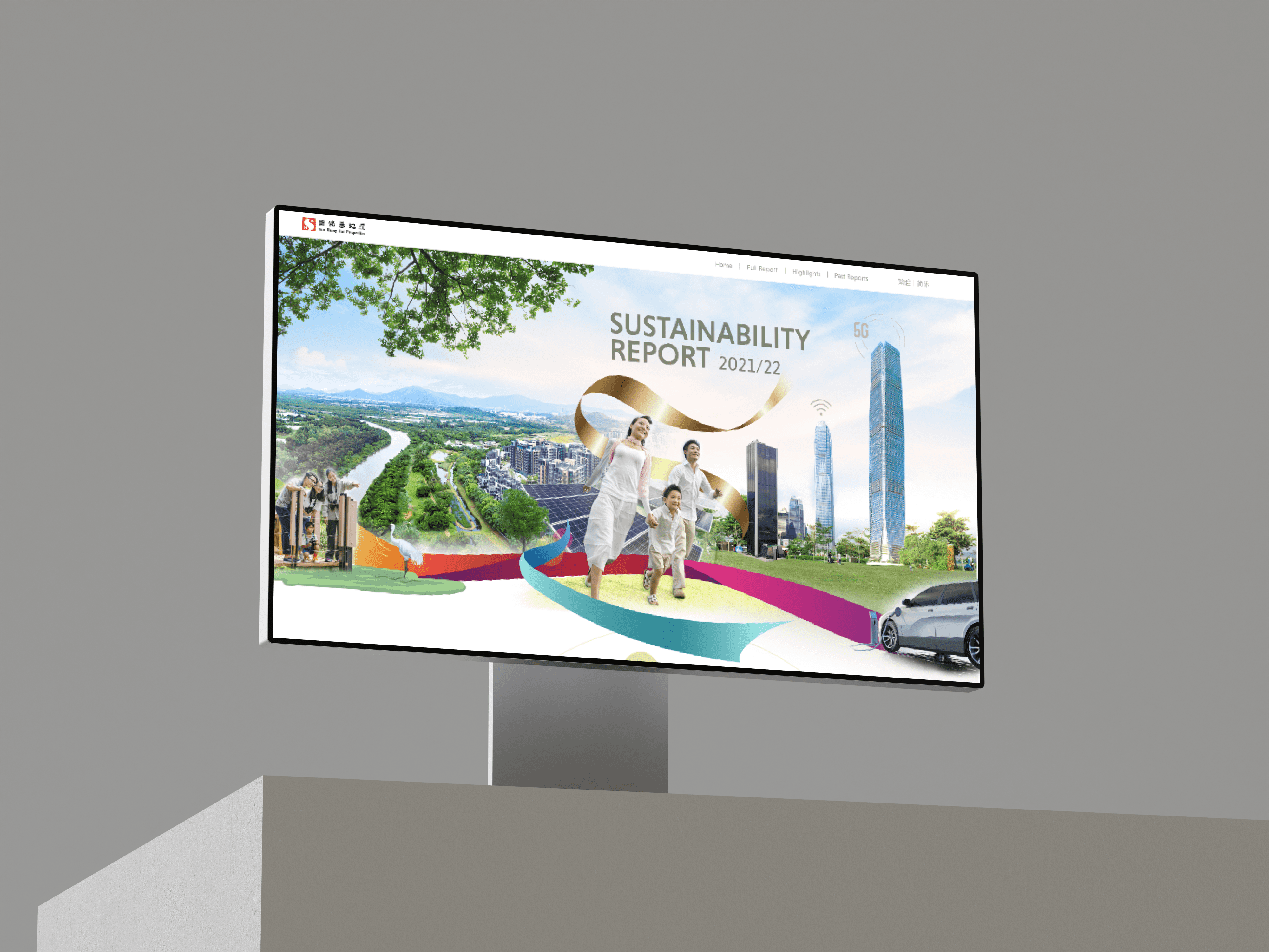
The company regularly launches an annual sustainability report online as a website. However, last year, the company wanted to present the report in a more energetic and vibrant way. They made a special request to incorporate a new color scheme and design elements that would help to convey their sustainability message in a visually appealing manner.
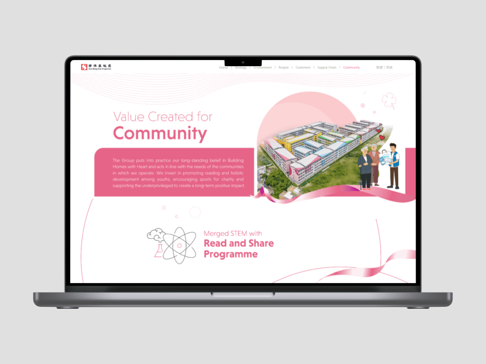
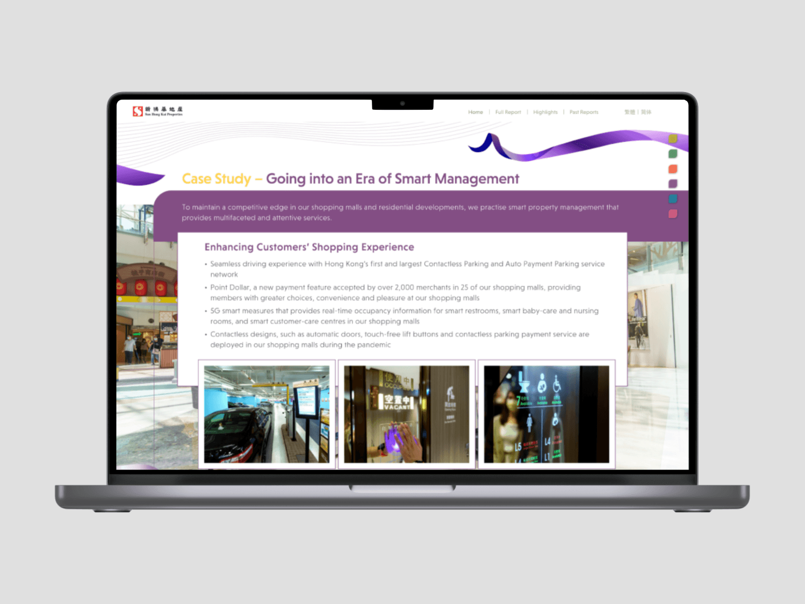
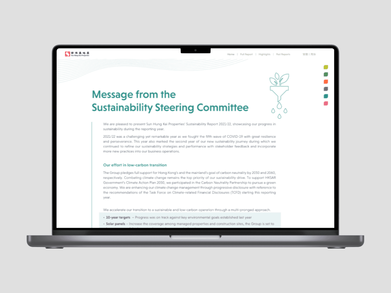
The design responded by creating a website with a color palette that resembled crayons, giving it a playful and youthful feel. The use of multiple colors in the simple lining patterns helped to create a vibrant and dynamic design. The website was designed with simplicity in mind, in line with the mainstream trend in design.
The result was a visually stunning website that perfectly captured the essence of the company's sustainability message. The colorful and playful design elements helped to engage visitors and communicate the importance of sustainability in a fun and approachable way.
The company's decision to revamp their sustainability report website design was a great example of how graphic design can be used to effectively communicate important messages. The new design not only enhanced the company's brand identity but also contributed to the success of their sustainability efforts.


