Services
Branding, Packaging
Summary
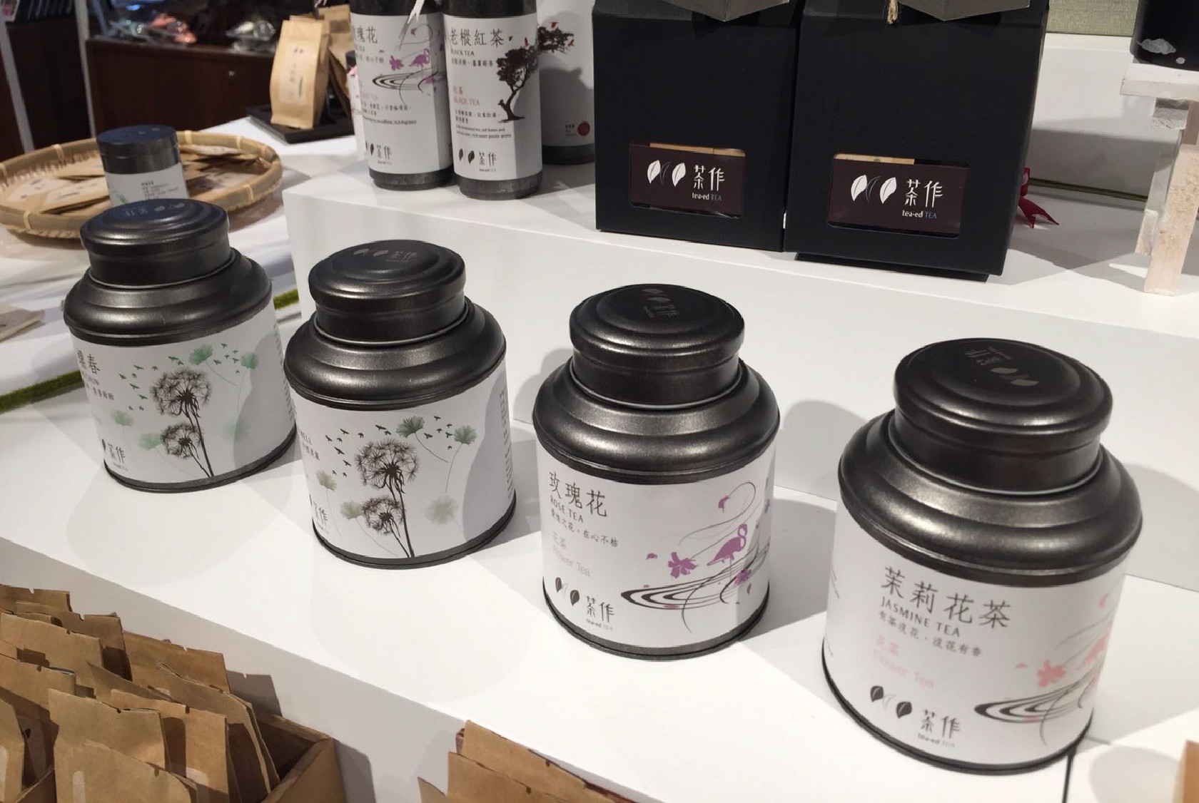
As a part of its efforts to boost public response and increase market share, the company decided to renew its identity. The first step was to conduct a comprehensive brand analysis to identify the areas of improvement. Based on the findings, a proposal was made to focus on trendy and fusion ways of consuming Chinese tea by simplifying the color use and graphic design.
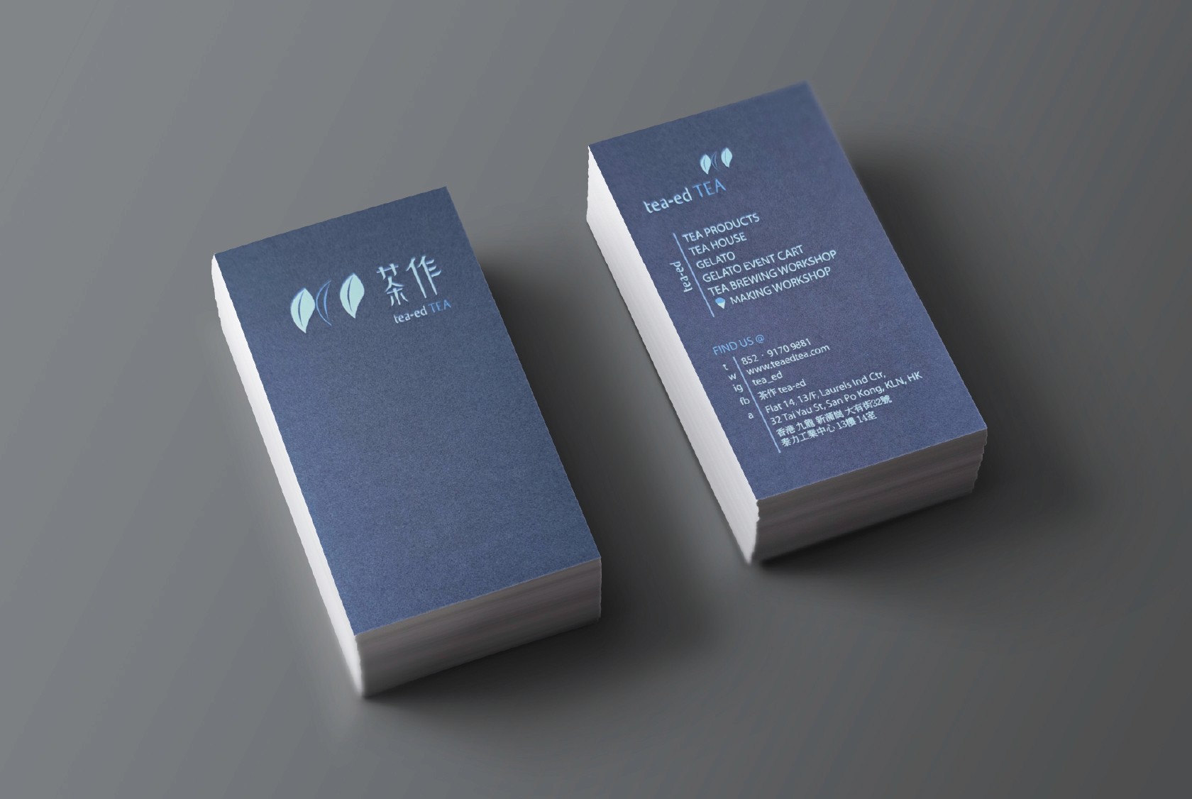
The proposal included a new brand logo that references real-life tea leaves with simple lining and shape. The logo's design is clean and minimalistic, which makes it easily recognizable and memorable. The use of monochrome color scheme on the logo allows it to be printed on a variety of materials and backgrounds, making it versatile and adaptable.
The new branding strategy was based on the concept of fusion, which aimed to blend traditional Chinese tea culture with modern trends in a way that appeals to the contemporary audience. By simplifying the color use and graphic design, the company aimed to make the brand more accessible and appealing to a wider audience.
Overall, the new branding strategy was a success, as it helped the company to increase its public response and market share. The simplified and trendy design, along with the fusion concept, proved to be an effective way of revitalizing the brand's identity and attracting new customers.