Services
Branding
Summary
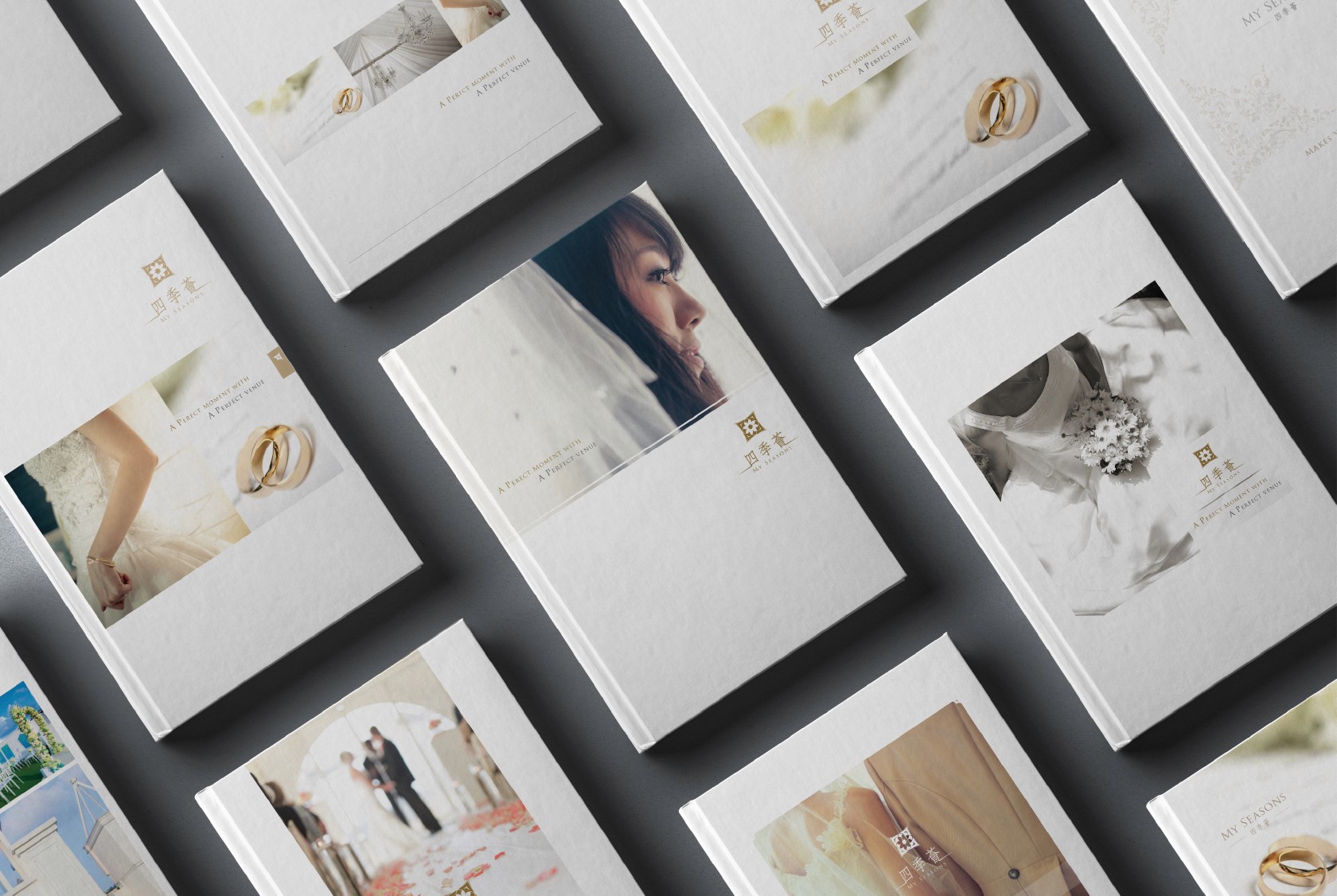
The company recognized the need for modernization and began its efforts with a revamp of its branding. As a wedding banquet venue in Hong Kong, the print materials used by the company were heavily influenced by traditional Chinese culture, which sometimes led to cliched designs. In order to create a fresh and modern look that better reflected the company's values, a brand analysis was conducted, which led to a proposal to simplify the patterns and color use, while also highlighting the company's elegant attitude.
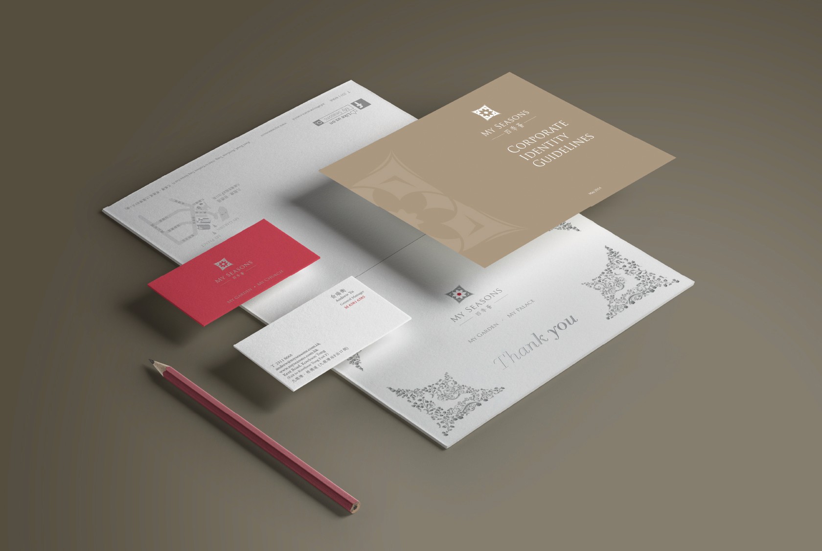
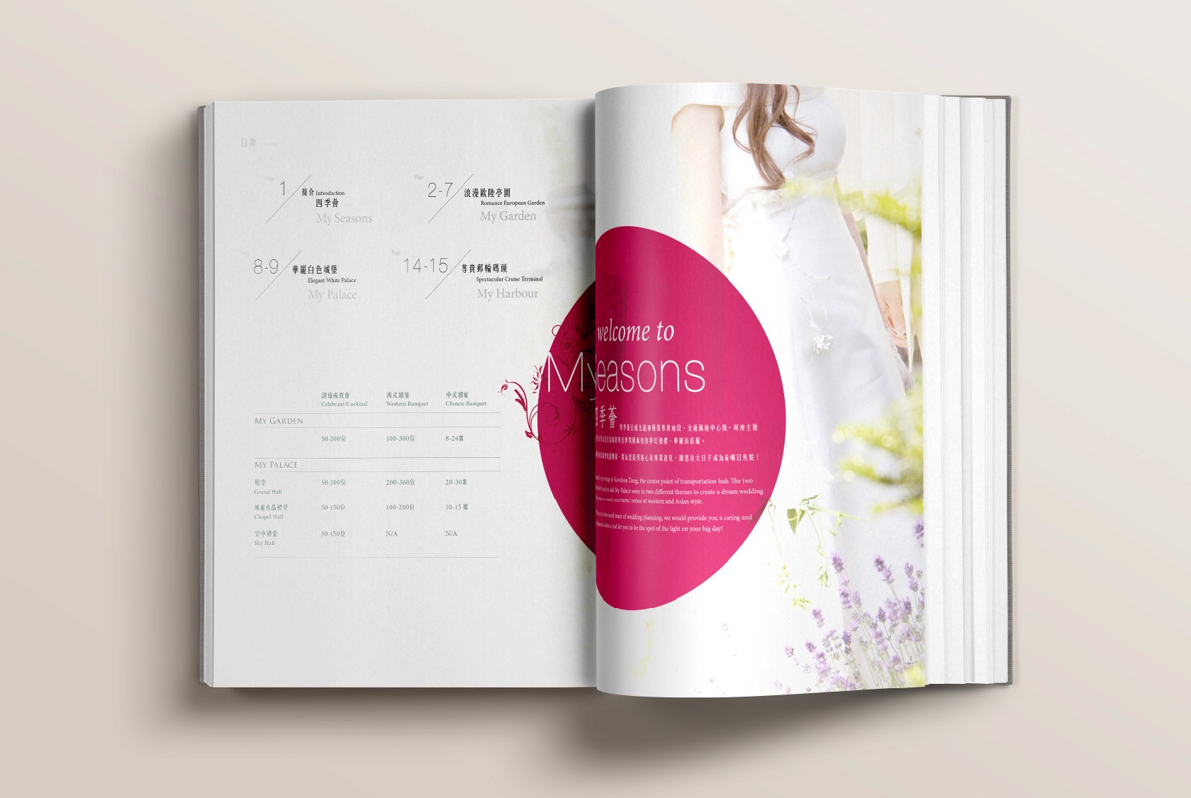
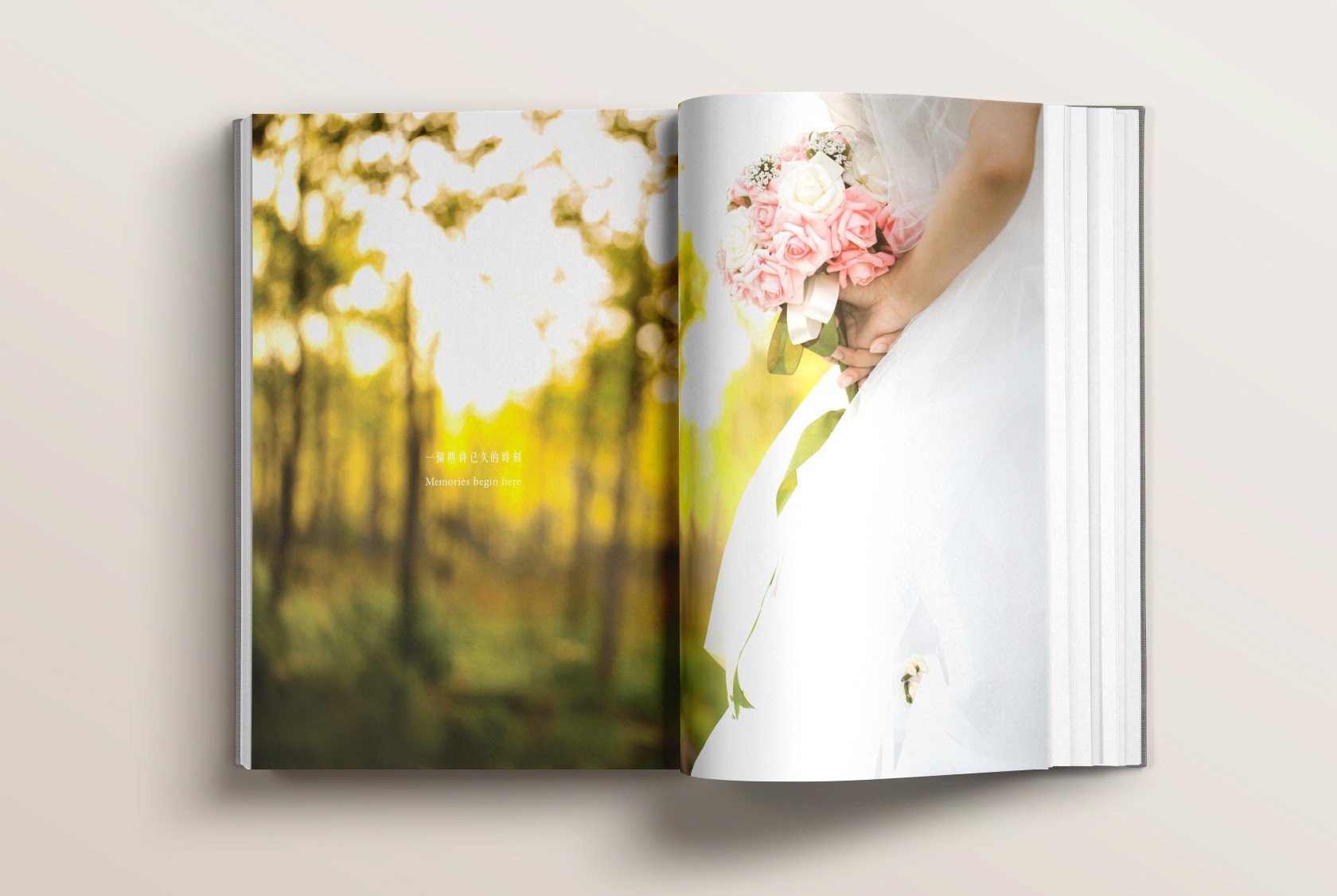
The proposal included a wide range of paper materials designs, including templates for wedding invitation cards, business cards, catalogs, and various souvenirs. The first step was to unify the color use across all designs, which created a sense of coherence and consistency. The design focused on incorporating a sense of luxury often associated with traditional Chinese cultural weddings, but in a more streamlined and contemporary way. The logo design and color use were updated accordingly, with the theme color of gold representing the company's elegance, and the traditional red color symbolizing the happiness of marriage.
Throughout all the designs, rose gold was also incorporated to add a touch of elegance and sophistication, appealing to the company's target audience. The design aimed to be modern and timeless, with a focus on simplicity and elegance.
The final result was a series of designs that were fresh, modern, and sophisticated, while still retaining the essence of traditional Chinese cultural weddings. By simplifying the patterns and color use, the company was able to create a more versatile and adaptable brand identity that could be easily applied across different platforms and materials. This branding overhaul helped the company to better represent its values and appeal to a wider audience, while still maintaining its unique cultural heritage.


